 Rejuvenate Digital
In the world of digital design, clarity and consistency are everything. A product’s interface can boast stunning colors, clever copy, and smooth animations—but if spacing feels “off,” users will sense something’s wrong, even if they can’t explain why.
That’s where the 8pt grid system comes in. It’s a framework that helps designers bring order, rhythm, and visual harmony to layouts—without overthinking every pixel.
What is the 8pt Grid?
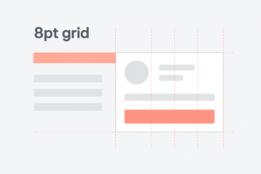
At its core, the 8pt grid is a simple spacing rule:
Base spacing, padding, and margin values on increments of 8 pixels.
Scale up or down using multiples of 8 (e.g., 8, 16, 24, 32, 40, 48…).
Why 8? It divides neatly into common screen sizes and works well across devices with different pixel densities. It’s also flexible enough to cover tiny gaps and large chunks of whitespace without breaking rhythm.
Why Designers Use It
1. Consistency Across Screens
Whether you’re designing for a smartwatch or a desktop app, sticking to 8pt increments ensures that spacing scales proportionally. No element feels out of place when a layout jumps between devices.
2. Faster Decision-Making
Instead of agonizing over whether a button needs 13px or 15px of padding, the grid narrows your choices: 8px or 16px. That limitation frees you to focus on bigger design problems, like hierarchy and interaction.
3. Collaboration Made Easy
When everyone on the design and development team speaks the same “8pt language,” handoff becomes smoother. Developers can rely on predictable values, reducing back-and-forth adjustments.
4. Polished Visual Rhythm
Like sheet music, the grid creates a rhythm your eye naturally follows. Elements line up, whitespace breathes evenly, and the entire interface feels balanced.
Applying the 8pt Grid in Practice
Here are some common ways to bring the system into your design workflow:
Layout Spacing
Use 8pt increments to define gutters, margins, and spacing between cards, images, or text blocks.
Component Sizing
Buttons, form fields, and icons should snap to multiples of 8. A button might be 40px tall (5 × 8), while an avatar could be 64px (8 × 8).
Typography Alignment
Font sizes don’t always follow the 8pt rule exactly, but line heights and spacing around text should respect it for cleaner alignment.
Responsive Design
On smaller screens, spacing might shrink, but it should still be proportional. For example, a 32px margin on desktop could become 16px on mobile.
Common Pitfalls
Breaking the Grid Without Reason
Sometimes 4px adjustments sneak in. While not “illegal,” they should be intentional (e.g., fine-tuning icon alignment). Avoid random deviations.
Over-Complicating
Remember, the 8pt grid is a guide, not a prison. Use it to simplify decisions—not restrict creativity.
Beyond the Numbers
The 8pt grid isn’t just about math. It’s about building a design language that feels intuitive to both users and teams. By adopting it, you create products that are easier to scale, easier to hand off, and—most importantly—easier to use.
Think of it like a silent rhythm in your design. When it’s there, everything feels smooth. When it’s missing, even the best visuals feel slightly off-key.
Final Thoughts
Whether you’re prototyping your first app or maintaining a mature design system, the 8pt grid is a lightweight but powerful tool. It helps you balance structure with creativity, ensuring every pixel serves a purpose.
Next time you’re spacing elements on a screen, ask yourself: Does it align with the rhythm? If the answer is yes, your users may not notice—but they’ll definitely feel it.
Other useful Articles:
8pt Grid
The 8pt Grid: Consistent Spacing in UI Design